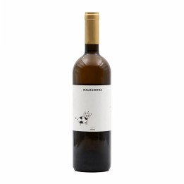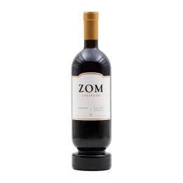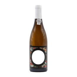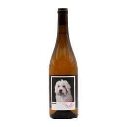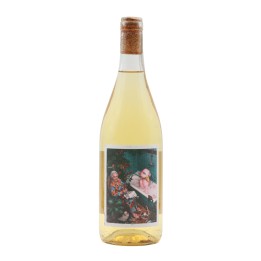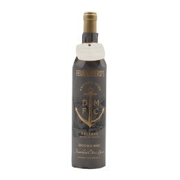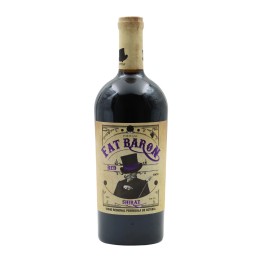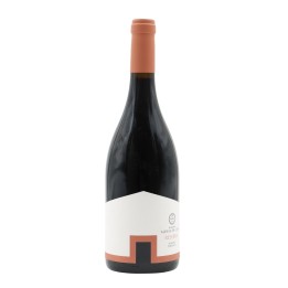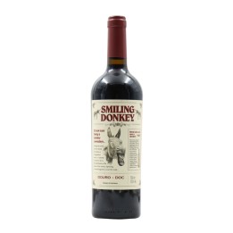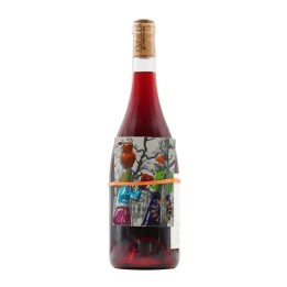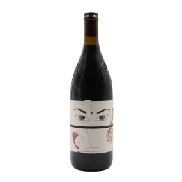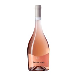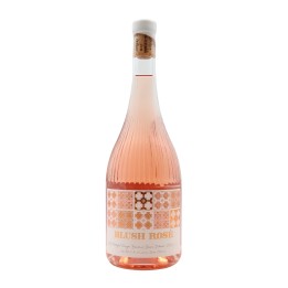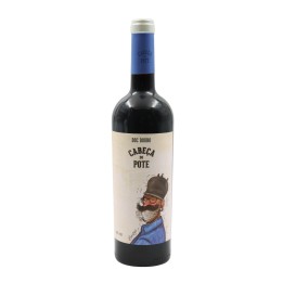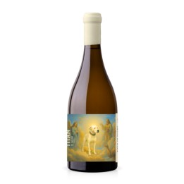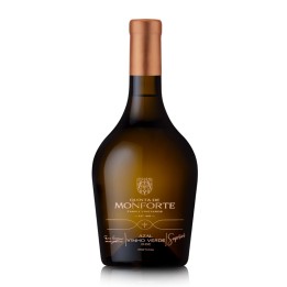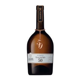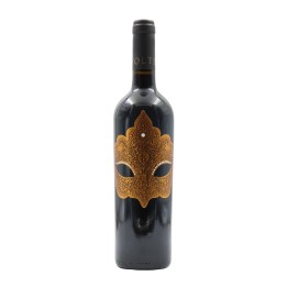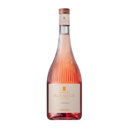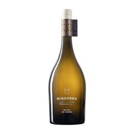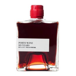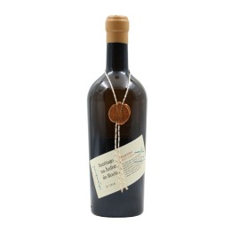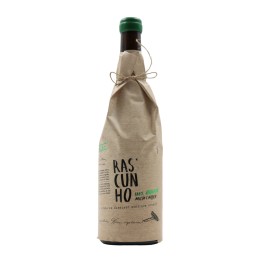
Some wines catch your attention even before they are opened. Not because of their name or region, but because of their label or bottle. In an increasingly competitive market, design has become an extension of a wine’s identity, and often the very first way its story is told.
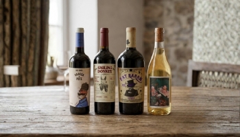
In Portugal, this trend has been gaining momentum, and it is now common to find wines that move away from traditional labeling, embracing bold typography, illustrations, or artistic concepts that reflect the personality of the producer or the terroir.
Some labels tell stories rooted in the land, family heritage, or tradition. Others take a more contemporary approach, almost minimalist, where less is more. There are also wines that use humor, irreverence, or cultural references to create an immediate connection with consumers when seen on a shelf.
But it’s not only the label that has evolved. The bottle itself has become a key element of differentiation. Unusual shapes, lighter or darker glass, engravings, and subtle details all contribute to a new visual language in the wine world. Together, these elements shape an experience that begins long before the first sip.
Of course, this focus on design does not replace wine quality—it complements it. It is there to make us pause for a moment and wonder: “what’s inside this bottle?” And often, that curiosity is exactly what leads us to try something new.