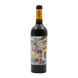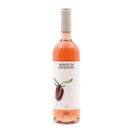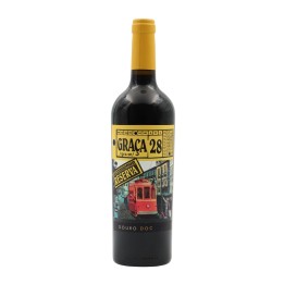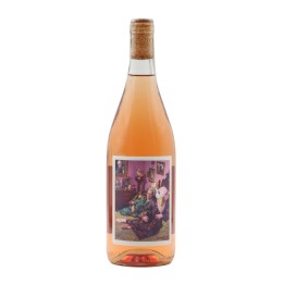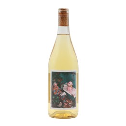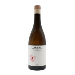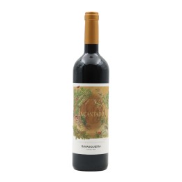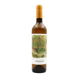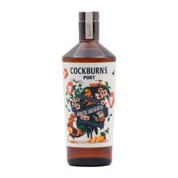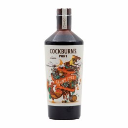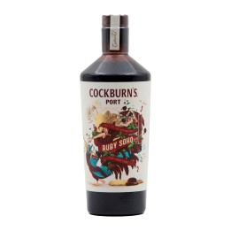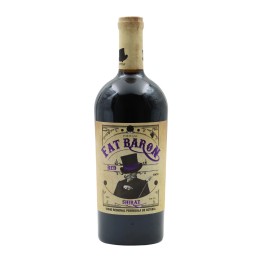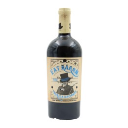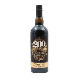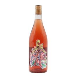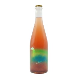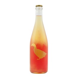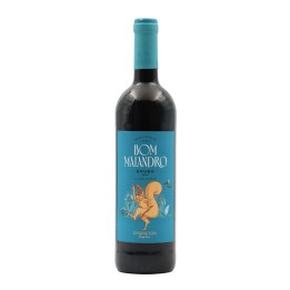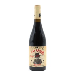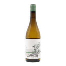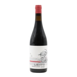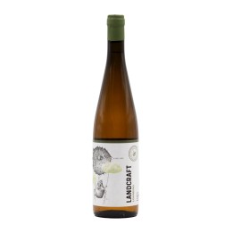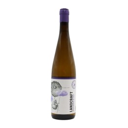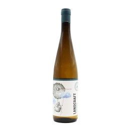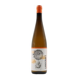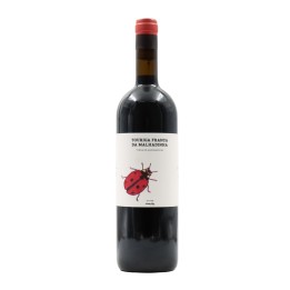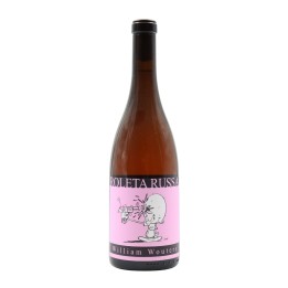
A label should be eye-catching and stand out from the other wines it shares the shelf with, because for many consumers this is a factor that greatly influences the time of purchase.
We tend to associate a more colourful and fun image with cheaper wines, and for more expensive wines we always think of more classic and elegant images. But this isn't always true... There are labels for excellent wines that are true works of art, some fun, others more abstract, but all of them make you want to keep the bottle at the end.
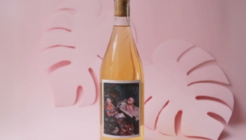
João Pato Aka Duckman wines are the perfect example of this. Their labels break all possible stereotypes. Artistic labels, just like the wine you'll find inside. Totally natural interpretations of Bairrada wines.
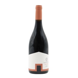
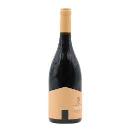
Herdade Aldeia de Cima won the gold prize at the European Design Awards in the ‘alcoholic drinks packaging’ category. It was the first time that a range of Portuguese wines had been considered the best in Europe. The design breathes Alentejo and its small, low, white houses, underlined by large brushstrokes of the vivid colours of nature, the cork oak leaf and the red schist soil.
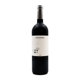
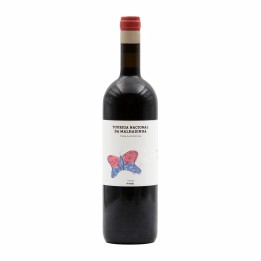
The children of the Soares family, who own Herdade da Malhadinha, are the designers of the labels produced by the family! The designs are adorable and summarise the philosophy that guides Malhadinha's activities - a family project!
Take a look at our suggestions today. Packaging capable of winning over any consumer!